It’s amazing how the smallest, subtlest changes on a site can massively impact millions of users and sites. This has long been the case with Google. We were reminded of this when Google Instant recently changed the dynamics of search behavior by force feeding popular searches. Today a new wrinkle has been added:
Google’s Little Blue Arrow
![]() Yes, the little blue arrow you see to the left is essentially the change that spurred this post. A simple 10 pixel x 10 pixel blue arrow that seems pretty harmless. Danny Sullivan of Search Engline Land writes it about it as well. It is apparently part of a keyboard navigation improvement project at Google (I think they were fascinated with how you could arrow down Google Instant suggestions).
Yes, the little blue arrow you see to the left is essentially the change that spurred this post. A simple 10 pixel x 10 pixel blue arrow that seems pretty harmless. Danny Sullivan of Search Engline Land writes it about it as well. It is apparently part of a keyboard navigation improvement project at Google (I think they were fascinated with how you could arrow down Google Instant suggestions).
Danny writes:
It feels sort of strange to me. Google Instant already focuses so much attention on whatever is at the top of the page that this seems like overkill.
I agree, it seems a little strange. However, I think both Danny & Slavik (who reported this to Danny) may have missed the impact this little arrow could have.
The Impact of Google’s Blue Arrow
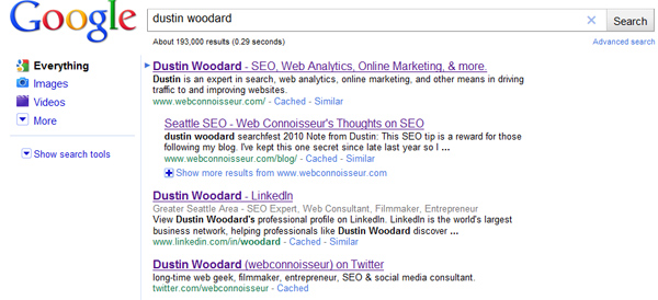
Before I jump into the impacts of “little blue, ” I want to make sure you see what it looks like. Here’s a search where there are no ads:

Pretty simple. The blue arrow marks the first listing. If you use your down arrow, you can navigate down the list. The arrow is not affected by mouse scrolling or paging down, so the intent is clearly keyboard navigation, which probably isn’t very common at this point, because Google never offered it before (before this change, using your down arrow would scroll you down the page as if you were using your mouse arrow.
Clearly the blue arrow draws additional attention to the first listing. I believe it may have a subtle impact on searchers who used to scan the first three or four listings to make their click decision, because the blue arrow pretty much says “look closely at the first listing.” This may give the #1 listing a small amount of additional traffic (as if it didn’t already get enough).
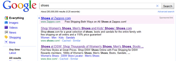
Where this gets a little more awkward is paid listings. Google applies the blue navigation arrow to paid ads as well:

This could help Google get a slightly higher click through on the top ad as well, meaning more money for Google.
I’ll admit, the impact of the arrowing highlighting the top listing, whether it be paid or unpaid, may be a minimal boost to any one listing. (though large when applied to billions of searches). But I noticed one thing, that makes the blue arrow much more powerful:
If you hit return twice, or hold the enter button for 1.5-2 seconds, the first listing is automatically clicked!
I believe holding down the enter button too long, or clicking it twice is a more common scenario then using arrow keys to navigate. With Google Instant, the I’m feeling lucky button is obsolete (not even sure why they have it on the homepage). But the I’m Feeling lucky leap of faith is back!
With the automatic click through to the first listing, the blue arrow has essentially become the I’m feeling lucky button! Only this time, paid ads can get the feeling lucky traffic as well. ![]() That’s a powerful little 10×10 image!
That’s a powerful little 10×10 image!


 I’ve been beta testing my new career as a 100% freelance SEO consultant after a decade of working in-house for some of the most successful Seattle-area web companies. So far I’ve limited my clients to “by referral only”, meaning I haven’t actively sought out any business & only considered companies who were referred to me by close friends.